Showing posts with label color. Show all posts

Wednesday, November 17, 2010

Detour continued...

I again accomplished nothing in The Room, but I did finally switch my family room from its spring and summer to fall and winter duds and thought I'd share how easy it is to do.  My reaction the first time I heard about seasonal decorating was "Way too much money; way too much work."  By the sixth or seventh time I happened upon an article expounding on the idea, I was on board.   I really didn't put a whole lot of time or money into it, but the difference between the two looks is still pretty dramatic...


spring and summer interior decor seasonal decorating

Spring and Summer


fall and winter seasonal decorating interior decor

Fall and Winter


spring and summer seasonal decorating interior

Spring and Summer


fall and winter seasonal interior decorating

Fall and Winter


Aside from the furniture placement (which is mostly dictated by the need to pull the sofa away from the baseboard heater in the winter), the two things that make the biggest impact are the floor and window coverings.  I made the curtains, drapes and valances, but honestly don't recall now how much I spent.  The area rug in the Fall and Winter room was purchased at Home Depot several years ago and used to serve year-round.  When I got the bug to do seasonal decorating, I didn't want to invest mega-bucks in another area rug so I ordered three yards of six foot wide #8 canvas from  Chicago Canvas, hemmed the edges all the way around with a glue gun and then went to town painting it in all my favorite colors...


hand-painted canvas floor cloth with stencil and mosaic work


hand-painted canvas floor cloth with stenciling

I used stencils for the palm fronds and filigree, and a piece of dense foam to stamp on the mosaic work.  The simple design on the outer green portions was done with regular old artist's brushes.  For well under fifty bucks, it really freshens up the room in the springtime and is such an easy project for just about anyone to try their hand at, whether free-hand, stenciled or even a solid color.  I made another, narrower one to run along the sliding glass door with a much simpler design (that I wish now I had done first because I really prefer it to the large one)...


hand-painted canvas floorcloth with stenciling

Though it does show dirt a lot more than the large one, I like the simplicity of it.


I also dress the mantle a bit differently for the seasons...

spring and summer seasonal interior decorating dressing the mantle

Spring and Summer


fall and winter seasonal decorating dressing the mantle

Fall and Winter


On the kitchen end of the room which is open to this family room side, I switch out my towels and rugs, using a coral-y orange in the spring and summer and a deep green in the fall and winter.  (I didn't snap pics of that because I'm behind on laundry and all of my spring and summer towels are dirty!)

There are other things I'd like to do differently between seasons, such as GET RID OF MY SOFA, and sew up some different cushions for the wicker chairs and some wintertime covers for the kitchen chairs, but for now I'm really happy with these simple changes twice a year.  

Tomorrow, I promise hope to have progress to show you on The Room.  It's supposed to be a bit warmer here, and if that turns out to be the case I'll be doing (drumroll...) the drum table!  Woot, I can't wait!  

Friday, November 12, 2010

Decorative wall treatment begun

My husband had the day off for Veteran's Day yesterday so I didn't get much accomplished.  I did at least settle on which option I'm using, and it's going to be the trees.  I was leaning that way simply because I've had this stencil for soooo long and wanted to finally use it somewhere in my own home, but also because the one vote I had when I was ready to get started was for the trees.  Here's my very minimal progress so far....


Just the trunks so far!  Dimensional stenciling has to be done in baby steps compared to regular, painted stenciling because each step has to dry somewhat thoroughly before going on to the next or you're going to mess up the plaster.  Which I actually did in a couple of spots that we won't dwell on.  This group of trees is next to the window at the end of the room opposite the bed.  I planted another group...


across from them and wrapping around two walls.  There will be a chest of drawers to the right of the outlet you see there, but it will sit back far enough not to interfere with the trees.   (Psst - see my luggage rack?  I'm inordinately excited about that thing.)

I came to another decision last night while I was working on the tree-trunks.  Well, a most-likely decision, and that is to nix the hidden rope lighting around the upper perimeter of the room.  There are a slew of reasons for nixing it:  1) it was going to be really wonky-looking in the corner where a window butts right up against a wall; 2) it was going to break up the flow of the trees; 3) it was going to make the room seem even more squat than it is (the walls in this room are only 7-/12' high); 4) it was going to be a nightmare to install; and most importantly 5) I had another Eureka! moment while working in the room as regards the wall behind the bed that would further interfere with lighting around the ceiling.  As you may recall, I was bemoaning the fact that I can't center the bed because of the window on that wall...


Then it occurred to me "Well, of course you can, bozo - all you have to do is pull the bed away from the wall a bit and hang curtains on either side.  It's going to push the bed further into the doorway than I like, but also further into the room so that it's not going to feel (too much) like you're tripping over the bed to enter the room...


This shot is taken from a couple of feet out in the hallway.  Now that the bed is shoved further into the room, the fact that it juts into the doorway is minimized a bit.  

Since a couple of my used-furniture store pieces are showing in that photo, I may as well give you a little preview of them now, too....


If I had seen this piece in a used furniture store a month ago...  No, scratch that.  I wouldn't have even seen it.  There's simply no way it would have caught my interest.  Then I happened upon another blog that made me see clunky, dated, 70s Mediterranean furniture in a whole new light.  I can't wait to get started on this baby!  Hopefully I'll be starting on this piece and the dresser sometime next week, and I'll share the blog that inspired me at that time so don't forget to keep checking in.

In the same shop, I picked up this footstool....


I love the mid-century modern lines and it'll be a piece-of-cake to reupholster.  

Of course, the best part about each of these pieces was the minimal expense:  The drum table was $12.50 and the footstool $20.  Woot!  I also picked up two bedside tables and a chest-of-drawers and altogether spent just over $100 for all five pieces.  For you local readers, I purchased all but the chest-of-drawers at Kathy's Used Furniture, which is where I've been buying most of my used furniture for the past thirty years; the chest was from Goodwill.  

That's it for today!  Thanks for stopping in - please let me know you did by saying "Hi!"  or "Are you outta your mind; there's no way to make that drum table look good!" or something.  ;)


Monday, November 8, 2010

Painting progress

As expected, covering up the raspberry zebra stripes took a couple of coats of paint, but progress has been made...


As I was scooting around the room on my tush cutting in the baseboards in the wee hours of this morning, I kept glancing over at the interplay of the newly painted walls with the current black trim and carpet in an empty corner of the room...


At first, it hit me wrong, but almost immediately on the heels of "Oooh, not so sure," my thoughts started going to "Hmmm, very art-deco."   Not current-day, Miami art-deco, but 40s Hollywood art deco.   


The above bath uses almost exactly the same two shades of green with black.  Love it!


I'm sure any of you who have ever done any house or apartment hunting in older sections of your town have seen this tile combo a time or two.  The woman who sent this pic to "ApartmentTherapy.com" was asking how to hide it.  I would showcase it!  

As I sat and looked at that stretch of black trim against the two greens last night, my second thought after "art deco" was that I could now see a way to make this room a balance of feminine and masculine.  My kids are probably the main people who will be using this guest room.  When I showed my son the bedding, his immediate and visceral reaction was "Floral?!?!?!!"  Okay, point taken, Chevy!  Since that "conversation" I've been looking for ways to masculinize the room a bit, and the art deco sub-theme seems a perfect jumping off point for that.  I've always loved art deco, but I've never, never been happy with any room I've done that's been true to one style and only one style.  I really prefer an eclectic mix, so I'm hopeful that I can blend the whimsy of the bedding and a couple of pieces of furniture I have planned with the more ordered elegance of art deco. 

Another thought I had while this idea gelled in my late-night musings was how much a luxury it is to be doing a room for myself rather than a client.  Not that I dislike having clients, believe me!  But if I were doing this room for a client, the basic decisions - wall and trim colors, fabrics, etc - would have been made at the outset.  I most likely would have chosen white trim instead of black, and I would have given the client a whole slew of reasons why that was the best choice.   And then, when I had my Eureka! moment in the midst of the work, I'd either have to sit down and shut up or go to the client for approval...

Me:  I know we agreed on white for the trim, but now I'm thinking black.

Client:  But you said white was classic and that black was going to be too heavy in this room.

Me:  I was wrong.

NOT a conversation that's fun to have with someone who trusts your judgment! 

By the way, cool as I do think the black looks, I brushed on some of the Regent Metallics Silver Bell with Behr's Black Suede and think this is really "it" for the trim...


I was actually going to go into a couple of other things today - bedside light fixtures, a few ideas I'm trying to decide between for the accent paint colors, and the headboard, but I need to get back to work!  Hopefully I'll have some photos with those accent colors up on the walls tomorrow.  In the meantime, I'm sharing this photo that I stumbled across while searching for art deco just because it made me go "Wow!"  I may make this a feature: a weekly or more frequent "Random WOW! of the week" photo.  Enjoy!


Designed by artist/architect

Friedensreich Hundertwasser

as featured on Furniture Fashion

Art as architecture, or architecture as art.  Whatever you call it, it really made me go WOW!  


Sunday, November 7, 2010

Hmm, I may have to re-paint

As I mentioned in my first post, the room I'm re-doing was my daughter's, re-done for her a year after her brother left for college in what I dubbed the "Fruit Basket Zebra" style.  I never did get photos of the room after it was fully decorated, but this mini-collage will give you an idea...

I stole the zebra-stripe idea from a room Doug Wilson did on Trading Spaces (though his was in the more traditional black and white), choosing the colors from a raspberry and tangerine plaid comforter my daughter chose.  The only thing that's still in the room is that barrel chair in the corner.  It's a really comfortable chair but, as you'll see in photos to follow, it's seen its day.  I would consider re-upholstering it (myself - I'm much too cheap to pay someone else to do it), but it wasn't a quality piece to begin with so  I'll most likely be setting it out with the trash this week.   

For now though, let's look at just how cute the current paint job is with the new bedding...


Woo-hoo!  Now that makes a statement!  


I know these walls must just seem insane to... well, almost anyone, but for my then-14-year-old it was the envy of all her friends.


There's that chair!  Yikes!  I was shocked at just how bad of shape it was in when I pulled the sheet off of it.  I don't like the mirrored closet doors either, but I'm not sure at this point whether I'm going to replace them or disguise them.  


I like black trim in some rooms and always thought it worked well with the Fruit Basket Zebra, but will probably be changing it with this re-do.  I'm undecided what color I'm going to use though.  All I know for sure is I don't like the idea of white with the carpet color - but I may change my mind.


Now we come full-circle back to the bed side of the room.  The paper lantern is, happily, the perfect color and I'll probably use it somewhere.  The ceiling is actually almost exactly the same color as the green in one of the toss pillows.... 


As you can see here.  But it's too electric a green for what I have in mind, so it's going to have to be painted.  Dang it.  I hate painting ceilings.  It's neck-straining, back-breaking work and of course I have plans that will make it exponentially so.    Now for the new, improved paint colors!


Ha!  That wasn't very helpful.  I clearly need to find a better way to photograph paint colors.  Until I do though, the color at left is Behr's "Dried Palm" and will go on the walls.  The strip in the center is Behr's "Home Song" and will go on the ceiling.  The top four colors on the right are all from Ralph Lauren's Regent Metallics collections, starting with  Silver Bell,  then Highgate, Olivine, and Thatcher Green.  The bottom is Behr's "Grass Cloth."  You're probably wondering now how on earth I'm going to work all of these colors in.  The answer would be: I dunno!  I have some ideas I'm kicking around, but haven't finalized my plan. 

A word about paint brands before I head up to start painting.  Most - if not all - painting contractors have one particular brand of paint they stick with for everything and it will usually be Sherwin Williams, Kwal or Kelly Moore.  They do this at least partly because they need a dedicated, full-service paint shop where they know they can go in and pick up exactly what they need at  any given moment, and partly because they get discount pricing when they establish an account and a history with a paint store.  When I first started painting professionally, I, too, used such a shop - Kelly Moore in my case.  However, at a certain point I started asking myself "Why?"  The cost of the paint in the total price of a paint job is really pretty minimal - it generally runs about 10% of the total job - so price alone certainly isn't/shouldn't be a determining factor.  I also got really fed-up with how badly Kelly Moore paints splattered when you rolled them on (this may not still be the case - I quit using them 15 years ago).  I also never needed a gazillion gallons at a time the way most painting contractors do, so convenience wasn't really a factor for me.  Considering those realities, I began using Consumer Reports recommendations to choose which paint I use on which jobs many years ago.  CR does a new round of testing every fall, and they rate a whole range of qualities for each sheen of paint, such as how well it hides with one coat, how prone it is to "sticking" (meaning if you use it on bookshelves, are the books going to stick to it - not how well it sticks to the wall), how smooth the finished surface is (not of much importance on walls in Colorado, since 99.99% of the walls here are textured), etc.  Both Behr (sold at Home Depot) and Valspar (sold at Lowe's) are consistently in the top three or four CR recommendations and I generally use one or the other.  I really prefer Valspar - it just seems to be a better "one coat" paint to me and it glides on like silk.   Also, Valspar is rated either "excellent" or "very good" in every category but "surface smoothness" which received a "good" rating.  Again, since there are virtually no smooth walls in Colorado, that's not a factor that really matters unless you're painting furniture.  Behr is rated excellent or good in every category except fading, for which it received only a "fair."  That's a much bigger consideration, particularly if you're using a deeply colored paint.  Since the colors I'm using in this room aren't deep though, I went ahead with the Behr simply because they had the colors I wanted to use in their paint deck.  And it's a lot closer to home. :) 

A couple of final notes on choosing a paint brand:  In recent years, Kilz (sold at Walmart) is giving the big boys a run for their money, but I refuse to shop at Walmart unless I have absolutely no other choice.  If you don't share that disdain, it's definitely one of the most economical choices.  Finally, paint companies reformulate their paints allllllll the time.  It makes me crazy!  Just when you think you know a paint, BOOM, they go and change it.  And the changes are not always for the better.  So take my recommendations today with a big ol' grain of salt, because they could be turned on end tomorrow.   

Thursday, November 4, 2010

The bedding

The room in question had a super-single-sized waterbed that I was way past ready to see out the door.  Don't get me wrong - I love waterbeds; my husband and I sleep in one and have from the day we married.  But when it comes to purchasing bedding for them you either have to be uber-wealthy or willing to settle.  Or sew.  And while I do quite a bit of sewing, I just really didn't want to go that route if I could avoid it for this room.  So I listed the bed on Craig's List and it was gone in under 48 hours.  Now I was free to shop for bedding with normal dimensions at normal stores.  Or rather, online...


I love the colors in this set - it has the same mixture of black, white and green that were in the room that initially inspired me.  But I wasn't wild about the 70s mod print, and knowing that I would never actually stage the room with the comforter pulled back to show the sheets, there really wouldn't be enough green for the finished effect I wanted.


This one is pretty enough, but it just doesn't do it for me.  That may be because it's vaguely reminiscent of the very first bedspread I bought when I moved out of my mother's home.  


While I think the mix of patterns and colors on this set is interesting, it doesn't make me bust out in a grin the way the inspiration room did so I quickly passed it by.


I like this set, but felt there would be too little green if I used the white side of the comforter and too much if I used the green side.  


From Macy's

I love, love, love this set.  Love it, I tell you!  However, I balk at spending sixty bucks on one toss pillow and knew I wouldn't be happy with just the comforter.  I also didn't care for the pattern on the sheets, so buying a couple of those to make my own toss pillows and shams wouldn't solve the problem.  It broke my heart, but I had to pass on this one as well.

Sometime in between finding the above set and resigning myself to not being able to have it for myself, I was out comparison shopping at every store in town for curtain rods for another room.  While in TJ Maxx, I spied this pillow in someone's cart...


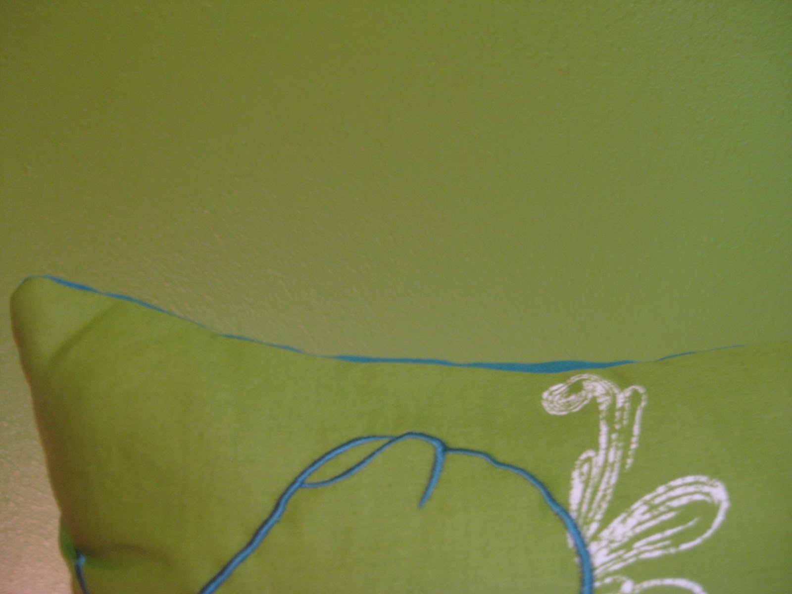
and could barely contain myself from snatching it out of their cart and putting it in my own.  I loved the color and the funky cut-work soooooo much, but much as I might love it, I didn't see how I could use it in any room in my house. 

Until the next day, that is.  Still pricing curtain rods, I took a quick detour to the bedding section at K-Mart and lo and behold, I found IT!

From the Jaclyn Smith Collection at Kmart

After that build-up, I can sense you're somewhat underwhelmed, but it was perfect for so many reasons.  It had the green I was looking for, as well as the black and white.  And it had the same fabulous deep aquamarine as the pillow at TJ Maxx.  But best of all?  It was only $49.99 for a full-sized set that included the comforter, two shams and bedskirt.  Wow!  There were also toss pillows priced at $12.99 each and I grabbed two small green ones and one larger teal/aquamarine one.  Then I made a beeline for TJ Maxx - praying all the way that they'd have another of those pillows in stock.  My prayer was answered and I was a very happy girl that day.

Until I sat down and started thinking about the deep aquamarine bedskirt being right up against the kelly green carpet that's in the room (and that I can no way justify replacing right now).  Ay yi yi, there's always a problem.  More on that in tomorrow's post...