Wednesday, December 8, 2010

Measure twice, cut once

Such a simple idea, but I'll never learn.  After spending the better part of the day butchering turkeys for the spoiled rotten dog who doesn't even live here anymore, and dealing - finally - with this...


which has been piling up for a month (which I know because there were two months utilities bills in there), I finally sat down at 7:30 pm to finalize my plan for the headboard.  I've been agonizing over the details of the design - and how that will impact the execution - for days now, but I finally at least decided that regardless of how I intend to treat the face, I want the general structure to be the same as the one shown in this absolutely fantastic series of videos on youtube...


Before I had my eureka moment where I decided to pull the bed away from the wall so that I could center it and do flanking window treatments, I had intended to simply upholster a piece of plywood and attach it to the wall.  But now that the bed will be several inches away from the wall, that obviously won't work - it will have to have legs and be bolted to the bed frame.  The video series (there are eight episodes in all) cover everything you need to know except how to upholster around the legs if you're not intending to do the shirred border they use which, coincidentally, is exactly the same width as the 2x4 leg.   I had also originally intended to do simple diamond tufting, but scrapped that idea a couple of weeks ago when it became obvious that the room is already quite feminine enough.  Instead, I decided to do channel tufting because it would echo a pretty common art deco design...


So, great - that would give me a way to force a 3-1/2" edge in there, but, I really, really, reeeeeeeeally don't want to do channels every 3-1/2" all the way across the headboard.  It would be too busy, and it would be a PITA!  So I played around and played around with variations of 3-1/2" channels and 7" channels and combinations of the two and finally just decided I'm overthinking it.  I (think) I will (probably) just do 7" channels and when I get to the part where I have to upholster around the legs I'll wing it!  

Having this "decided," I headed out to the garage to start cutting the lumber.  I already had the headboard itself cut out, so I figured it would take me fifteen minutes to cut the 2x4's to the correct lengths and then I could get the sucker glued and screwed together and go to town.

And then I cut my longest 2x4 WRONG.  And did not have enough lumber to make it up.  And Home Depot was closed by this point, of course.  So here I sit, having once again screwed myself because I'm always so damned scatterbrained.  This isn't the first time I've cut WRONG.  I do it with lumber, I do it with fabric, I do it with anything you can think of that can be cut.  And every time it happens, it's because I'm not fully "present in the moment."  I'm always thinking about what I can do after I finish the current task, and sometimes what comes after that, and after that, and after that.  It's a sickness, I tell you, and I wish they'd make a pill for it!  

Manana!

Tuesday, December 7, 2010

No more fish bowl!

My sister is going to pounce on me for this, saying "OMG, you sound just like mom," but I really do hate uncovered windows at night.  It's one of mother's (many, many, many) pet peeves and you can be sure she'll comment if she's around and you don't get the curtains closed promptly at twilight that "I feel like I'm living in a fish bowl!  Anyone and everyone can stare in here!"   My issue with uncovered windows has nothing to do with privacy, however; I just think a big, black expanse of glass is cold and unwelcoming.  This is soooooo much better...

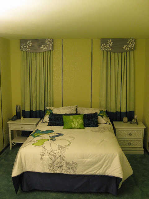
bedroom with two-toned curtain and dimensional stenciled cornice

Woot!

bedroom with two-toned curtains and dimensional stenciled cornice

a little-bit-closer Woot!


and an other-end-of-the-room Woot! 

I am so, so, soooooo glad to have this part of the re-do out of the way.  I really don't enjoy sewing; I do it only because I can so rarely find what I want in the colors I want.  In the case of these curtains, I also saved a bundle because the fabric was dirt cheap ($2.99/yd), but that's really not usually the case these days.  For instance, I made my daughter a computer satchel and laptop case for her birthday this year and spent a hundred bucks for the fabric and pattern.  Ridiculous!

If you've been reading from the beginning, you may recall I was very nervous about how much trouble my cheap-o polyester satin was going to give me, but because I used broadcloth for the lining I didn't really have any issues with the slip-sliding and instability I was expecting.  It wasn't even necessary to use the spray starch my sister suggested, though I did use it after they were completed to give them a bit more body and the #$@##%#%! stuff left stains all over the fabric which I'm just trying to ignore for now.  (They're very faint, but once I hang the lights in front of the two flanking the bed it may become a bigger issue.)  

In the last photo above, you can see the corner of my eyesore-of-a-chair hidden under a couple of throws I picked up.  The green one isn't really the right shade of green, so I'll probably end up using it in my family room.  The other one is the P.E.R.F.E.C.T. shade of aquamarine, and has a really pretty brocade look that you can't see very well in the picture.  And it was a steal at ten bucks.  But.  Sigh.  It sheds like crazy and the fluff that comes off of it glues itself to anything it touches verrrrrrrrrry securely, so I'm going to run it through the dryer with a wet towel a couple of times and if it doesn't stop it's going back.  Darn it.  

Oh, and in the other photos you may notice I've been busy shopping for fun stuff to set about.  No?  Well then, here...


The little frame is a Hobby Lobby find that I'd like to use for a silhouette of my daughter; the clock I found online and had my Dad order (oh, CRAP!  I keep forgetting to send him a check!) because he has a clock shop and I wanted his discount.   On the other side of the bed...

decorative accents

are a couple more Hobby Lobby finds.  I thought the bird was apropos because of the trees, and I just thought that candle holder was fantabulous (and a measly five bucks at half price).   They'll both probably be moved over the the dresser when I get it painted (Thursday, if the weatherman isn't lying to me about the 60 degree temps).  

Back to the topic of sewing for a moment:  A couple of years ago, a guy on one of the decorative painting forums I occasionally pop into was lamenting that while people think nothing of spending thousands of dollars on custom window treatments, they balk at spending the same amount for, say, a decorative paint treatment that will grace all of the walls in that same room.  I really wanted to give him a piece of my mind, because he obviously has no bloody idea how time-consuming sewing is.  For instance, I spent three times as long on the sewing for a recent job as I did on the painting, but charged three times less because that's what I felt the market would bear (based on how much it would cost her to go out and purchase similar items ready-made).   

Next up:  The Headboard!  I probably won't have it finished until Wednesday, but will post whatever progress I make on it...

Manana!  

(BTW, I love the word "manana" ever since a Mexican guy told me "It doesn't mean "tomorrow morning;" it means "Not now."    And it's so much catchier than "Uh, whenever!")

Wednesday, December 1, 2010

Building a cornice

This one's going to be short, sweet, and relatively boring, folks!

I realized pretty quickly after pulling out the plywood I had leftover from another project that it was just not going to work for my cornices.  It's just much, much too rough on both sides, and with the added problem of the edges showing (and therefore needing some sort of "hiding" fix since you can see the plies), I finally convinced the miser in me to just make life easier and buy the right thing for the job.

While I was at Home Depot picking up the cornice board wood, I also purchased the plywood for the headboard.  Wow, did I luck out on that one!  They had a couple of pallet loads of  "special purchase"11/32x4x8 A/C plywood for only $25!  (I was expecting to shell out around $40.)   Oh, and puh-lease, lumber guys, what's this 11/32 crap?!?   I stood there looking at that number and trying to figure out what normal number  it would approximate,  then gave up on doing the math in my head and took out my handy tape measure (that I go nowhere without) and it measured 3/4" (which, btw, is much larger than 11/32).  Why can't they just call lumber by its actual measurements?

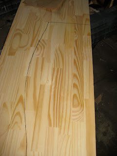
We left off yesterday with my paper cut-outs, so the next step is to use that to trace the shape onto the wood...

DIY cornice

then grab your jig saw and cut it out.


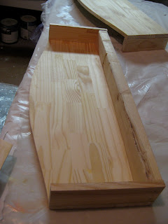
I didn't want or need these cornices to be very deep, as the curtains are going to be lightweight and the rod and rings just your average, cafe rod size, so I used a 2"x3" along the top of each cornice and finished out the sides with pieces cut from the same material as the face...

DIY cornice

It's all glued and nailed together snugly, and I really do have all of them built...

DIY cornice

...and I was so excited to get them primed and base-coated, but the @#$!#$!@ wood putty I used to fill the nail holes needs 24 hours to dry if you're using anything but latex paint.  I always use B-I-N primer, which is white pigmented shellac, for...practically everything.   Fun fact:  Did you know shellac is made from bugs?  The lac bug, to be precise!   I love, love, love the stuff because it cleans up with ammonia rather than mineral spirits and it leaves a super smooth finish for your next coat of paint.  Which I will be applying...

Manana!  


Tuesday, November 30, 2010

Designing a cornice

The next thing I feel I really need to get done in the room is the curtains.  It feels so cold in there, especially at night with the blackened windows staring at me.  I would really prefer to hang the curtains from simple, silver rods, but the window on the south wall butts right up to the closet wall....


...which of course means there's no where to install a bracket to hold the curtain rod.  I actually considered drilling a hole in the wall the same diameter of a drapery rod and just sliding it through and attaching the finial inside the closet, but that would just look weird.  So I'm building simple cornices instead.  On the plus side, this should save me a bit of money, because I can use those simple (and uber-cheap) cafe rods and rings to hang the curtains under the cornice.  

Building a cornice is pretty easy, if you're not afraid of power tools.  I'm sure there are scads of other "how-tos" on the web, but I'm going to do a blow-by-blow of my method anyway.  (Mostly to kill time, since I haven't gotten any farther than my paper cut-outs!)

My design for the cornices comes from the shape I've chosen for the upholstered headboard I'll be making.  Initially, I thought I wanted a very simple, rectangular headboard, but then I saw this...


and realized that was IT.  Actually, I love the entire bed, but I don't have a cool platform bed like that, and my bedding is obviously not as minimalist.  I do love the minimalist look I've been seeing in a lot of bedding over the past five years or so, but I always seem to opt for pillows, pillows, and then another pillow or two for good measure.  Nonetheless, I think the headboard shape is going to work well in The Room, so I'll be repeating it in the cornices.  

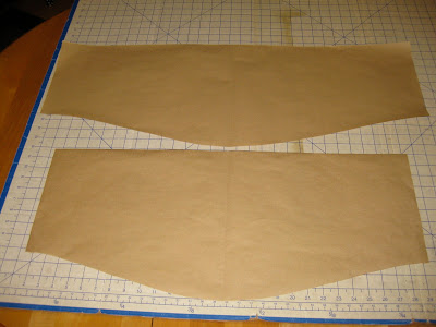
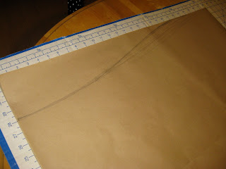
To get a pleasing and symmetrical curve I just use some brown kraft paper, cut out a rectangle the same width as the finished cornice, draw a straight line down the center and start drawing curves to meet the line...

DIY cornice

That top curve was waaaaay too pronounced; then I realized why - I hadn't cut my rectangle to the proper height!  I want the cornices to be nine inches at the outside edges and twelve inches at the deepest point in the center, which corresponds to the lower penciled curve.  When I had what I felt to be a pleasing curve, I folded the paper in half along the center line and cut it out...


DIY cornice


Then I did the same thing for the slightly larger cornice that will be needed on the second window, and I have my two patterns...
DIY cornice


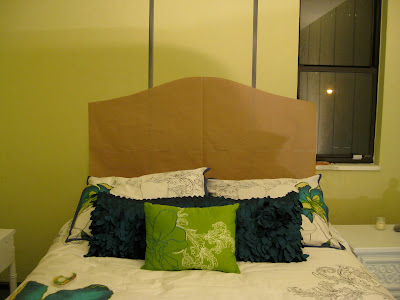
Then, so long as I had my handy-dandy pattern board out, I decided I may as well make up the pattern for the headboard as well.  First, I took the pattern board up to the room and balanced it on the bed to get a sense of the size I was going to need...


DIY upholstered headboard

And as luck would have it, the pattern board itself was just about the perfect size, so I just took my pencil and started drawing the curve right there in place to get a sense of it.   


Then I pieced together some brown kraft paper so I had a 56" x 32" rectangle.... 


DIY design an upholstered headboard

and drew my curve, cut it out and ran upstairs to tape it in place.  Whereupon I felt like I had tumbled into the tale of Goldilocks and the Three Bears...  


DIY design an upholstered headboard

Goldilocks thought the center top of this curve was too flat.


DIY design an upholstered headboard

Goldi thought the overall curvature of this one wasn't pronounced enough.


DIY design an upholstered headboard

Goldi thought this was just right!  Last night, that is.  Today, Goldi much prefers version number two, so it's back to the drawing board.  I my need to re-cut the cornice board patterns as well, as I just feel the curves are now too pronounced and lending yet another feminine air to the room.  

Once my patterns are perfected, I'll lay them down on the wood of my choice, trace them out with a marker and cut them out using a jig-saw/saber-saw.   I'm a bit on the fence about the wood right now.  For the headboard, I'll just use a piece of either 1/2" or 3/4" thick C-grade plywood.  Since it will be upholstered, the wood just needs to be sturdy, and plywood offers that quality.  For the cornices, I would really love to use a couple of scraps of plywood I have in Studio A, but they're also C-grade which is not really suitable for painting (I intend to paint the cornices rather than upholster them).  On the other hand, I'm going to be doing some dimensional stenciling on them as well (using Liquitex Modeling Paste rather than drywall mud), so that may solve the problem of the face not being smooth.   I'll have to do a trial run to see if the plywood will work.  Hopefully, I'll have that figured out and the remainder of my goofy little cornice tutorial ready by tomorrow.  Believe it or not, I do expect to have the cornices and headboard finished by week's end, and the curtains started, if not finished.  I guess I should quit dallying here and get busy, huh?

Manana!  


The Furniture!

I've been AWOL over a week, but spent most of that time battling a piece-of-crap carpet shampooer that was falling apart and spouting leaks every which way, and a cold that had me semi-laid-up for most of the latter half of last week (including Thanksgiving Day, natch).  These carpets are going to be the death of me,  I tell you.  I must've put waaaay too much soap in the mix and I'm having to rinse them over and over to get the soap out.  Add to that that I'm just OLD now and I can't clean carpets from morning till midnight the way I used to, not when my carpet cleaner has declared himself my nemesis to the death. He's dripping copiously from the wand/hose connection (hence the gender) so by the time I've sucked up the water in one spot, he's dribbled a pint's worth in another (I'm not at all sympathetic simply because he's geriatric, too, btw.)  And pieces keep falling off of him.  (Not a gender issue - no Bobbit in my blood).  He just...hates me.  And he's winning.   I've set aside the battle with 1/2 of one bedroom yet to clean and a few more rinsings of the library and living room and Mr. Shampoo-Rinse-Repeat-Indefinitely lies there mocking me each time I pass.   Sigh.

However!  I did manage to get a few pieces of furniture painted.  First, the "before" pics...

DIY refinished painted furniture


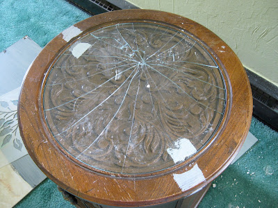
The drum table, which I've already shared here.  What I haven't shared yet is how I blew my $12.50 bargain by absent-mindedly using it as a base to set a gallon can of paint down and push the lid into place.  This is what resulted...

DIY refinished painted furniture

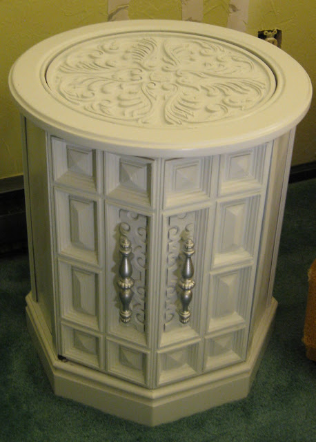
So much for my bargain!  It'll probably cost me twenty or thirty bucks to replace the glass, but at least it's do-able.   Moving on though, here's what it looks like now...


DIY refinished painted furniture

Please ignore that little dark spot where the paint rubbed off at the lower left of the door.  I was impatient.  (Soooo unlike me!  ;)  The filigree bit behind the handles are part of the handle, but I painted them white because I just wanted a touch of silver.


I found this baby on CraigsList last night....

DIY refinished painted furniture

It was advertised at $20.00, and I gave them a twenty when I walked in the door, but just before I drove away, the seller caught me in the driveway, handed me a $10 bill, and said she thought it had been listed at $10 rather than $20.  I didn't argue with her a lot, and it was the highlight of my day.   It's got that same 70s Mediterranean vibe to it as both the drum table and the dresser that's still sitting in Studio A awaiting my attentions.  (Pray I don't hit the gas inadvertently before I get it out of there or the thing's history.)   Oh, and btw, I'd like a big ol' pat on the back for resisting the call of Mad Greens on my drive home with my treasure, what with that found ten bucks burning a hole in my pocket.  Mad Greens is my latest obsession for a quick, (relatively) cheap bite.  If you live in Colorado, you've got to try them.  If you don't live in Colorado, I'm going to have a killer guest room you can stay in when you come here to check them out.    Soon.  Ish.  :)

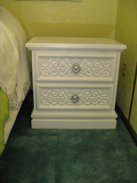
On with the pictures!   Here's how the night-stand looks now...


DIY refinished painted furniture

I may re-do the knobs on this one in white.  The metal primer I used on them was white and they looked really cool that way, but I had intended to use silver hardware on everything so I went ahead with the silver "just to see" and now I think I preferred them white.  They're okay as is, but I think I'll try antiquing them first, as the chain I'll be using for the lamps that will hang over each nightstand is silver flecked with black, and then if I'm still not in love they're going back to white.


If my sister is reading this, she's probably going to be underwhelmed by the plain old coat of white paint,  particularly after saying I do "interesting things" with furniture.  But I was inspired by this set of before-and-after photos from Enchantresses 3 that I found via Addicted2Decorating...


 Before 


After  
(more photos can be seen on either Addicted2Decorating or  Enchantresses 3)


I was absolutely dumbfounded when I saw how that truly-ugly "before" cabinet turned into a really striking and commanding piece with just a simple coat of white paint.  As I said when I first posted a photo of the drum table, I never would have even seen it had I not first seen these before and after photos.  It's chunky, 70s-style, goo-gaw Mediterranean (I think that was actually the industry term for it); waaaay too reminiscent of my very first living room furniture "suite" from 1974.  When I hunt for used furniture pieces with a eye to re-finishing them, I generally look for pretty simple, classic lines and then use paint colors or techniques to add personality if it needs it.   If I hadn't run across and become of fan of Kristi's blog, I never would have thought of this.  She's really opened my eyes to a few things that I had long ago passed of as passe, or knew about but just never seriously considered.  And while my smaller pieces aren't as striking as this massive cabinet and hutch, a simple coat of white paint  turned them into something completely new and fresh and perfect (for my current budget and tastes).

I have a chest-of-drawers and another nightstand that will be getting the same treatment, but haven't tackled them yet.   Lawdy, you should have seen me at the end of the night after spray-painting these pieces in Studio B.  Ha, for that matter, you should have seen the spider webs in the basem... er Studio B's windows.  It looked like Christmas down there!  Speaking of, this is the first time I can recall ever using spray paint to refinish a piece of indoor furniture (as distinguished from painting furniture indoors).  I'll go more into my reasons for that tomorrow, since I expect it to be a relatively slow news day. ;)  Did I mention my husband is off till after Christmas?  :)  See how smiley I am?  :) :) :)   I made muffins tonight!     Holiday-timey muffins...and I'm off to have another one...:)  

Manana!   


Wednesday, November 24, 2010

Mea Culpa

This is mostly directed at my one faithful reader, Laurie:  I am so, so, so sorry I said I'd be back "after the weekend" and then... wasn't.  I won't bore you with all the tawdry details/excuses.   I'll be back FOR SURE on Monday.  Possibly sooner, but I'm making no promises anymore.  :)

Friday, November 19, 2010

How-to: Clean-edged stripes

Once again, I accomplished diddly-squat in The Room.  I spent the bulk of the afternoon driving from one Hobby Lobby to another, amassing the yardage I'm going to need for all of these floor-to-ceiling curtains I have planned.  By the time I got home and had dinner it was after 8:00 p.m. and there's just no way I feel like starting on anything after 8:00 p.m. - not when there's an episode of Medium that needs watching (which, today's paper tells me, has been cancelled again).

I forgot when I was typing up last night's blog entry that I had snapped pics of the striping process, with plans to show how to get (almost) perfectly clean edges.  I'm so glad I forgot now, as it gives me something simple to blog about today!

As I've mentioned before, in Colorado you can't find a smooth wall to save your life.  Most drywall is finished with either "orange peel" texture which looks like this...


Or with "knock-down" texture which looks like this...


Both textures can be a nightmare for faux finishers and decorative painters, but the orange peel in particular... Well, let's just say there's a special place in hell reserved for the joker who came up with that one.  You only have to take one look at it to understand why you're not going to get nice, clean lines by simply taping over it.  I obliterated the dreaded orange peel from my home in all but one bathroom and the ceiling of The Room, so I don't have a handy spot to show you here, but you can see just from this photo what happens when you tape over texture of any sort...


DIY tip paint clean line with painter's blue tape on textured surface

No matter how securely you think you've pressed down your tape, there will be gaps for paint to sneak under and you're going to end up with a messy line.  There's a super easy fix though...


DIY tip paint a clean line on a textured surface with blue painter's tape

Before you go in with your stripe color, paint over the tape with your wall color first.  That way, the paint that sneaks under the gaps will match the walls and disappear!  If you for some reason don't have any of the wall color, you can also use a clear medium, such as the waterborne polyurethane I used for my tone-on-tone stenciling, but you'll need to be sure it matches the sheen of your current wall color.  If you need matte, the only product I know of that will work is Modern Masters Dead Flat Varnish.  It's pricey, but you won't need much.  

By the way, the temperatures here came no where close to the high of 60 that was forecast for yesterday and today, so you can blame the weatherman for there being no progress on the drum table.  I was hoping to do that one in the my main level studio (otherwise known as "the garage"), because toxic fumes will be involved, but it looks like I'm just going to have to hold my breath and do it in my lower-level studio (also known as "the basement").   

That's it for today, and I'm definitely taking the weekend off from blogging in the hopes of having something more exciting to share on Monday.  Thanks for stopping by! 


Who let Shel Silverstein into my room?

I know it looks like I skipped a day of blogging, but my rationale has always been "it's still today until I go to bed," so in fact I'm just late!   This is really just a better time for me to sit down and chart my progress (or distract from the lack thereof) than in the middle of the day.  I'm finding it hard to get my aging buns back in gear if I sit down for an hour or more to write in the middle of the day,  so I'm grounding myself from the computer until after ten p.m.  Well, except for gmail/chat (gotta have my Evin fix).  And FB (only so I can keep up with my kids ;).  And my three games of Wheel of Fortune every morning.  Of course.

There I go digressing again.  I hinted that I wasn't happy with the tree in a reply to a comment yesterday.  Sigh.  I really, really blew it picturing this one in my head.  I was hoping for dramatic and instead I got what might be a great cover for "The Giving Tree" but is so not right in this room...


I'm going to leave it for now, but I expect that I will probably be going back in and painting all of the leaves silver.  As it is, it's just too cutesy.  The trees on the other side of the room, I think I may just leave white, but I'm going to hold off on any firm decisions about the trees until I get all of the soft furnishings in the room.  There's going to be so much added color with the curtains and headboard and whatnot that I may not need the extra color on the walls at all.  (This is one of those many instances where Having A Firm Plan would have saved me time and money.)

You might have noticed that I did some exploring as I sat in that chair (blame the early lunches - I end up sitting in that chair a LOT after an early lunch), pulling a bit more of the fabric and stuffing away from that right arm so I could see what I have to work with.  Lawdy, this is going to be a job.

In other news, I got a good start on the rest of the walls...


tone-on-tone stenciled leaf and leaves pattern


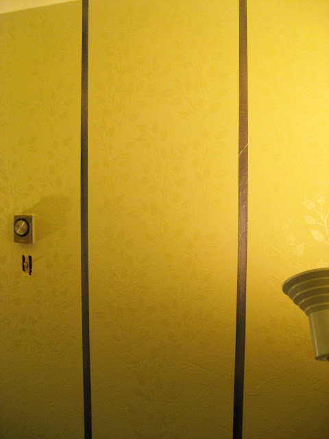
The colors aren't true and I'm a PhotoShop idjit, but hopefully you can see what I've done here.  Which is to use the leaf stencil semi-randomly within each of the metallic gray stripes using a clear, low-luster (satin) waterborne polyurethane.   (Benjamin Moore's "Stays Clear" in this instance, but any brand will do.)   Since the base coat is flat, the stenciled leaves give just a glimmer of a pattern to the walls.  For the stripes,  I used the same blended colors I used on the bit of trim I painted.  (Ralph Lauren Regent Metallics "Silver Bell," with Valspar's "Black Suede")


tone-on-tone stenciling

A little bit closer.  By the way, my lines really aren't bowed like that.  My camera seems to be distorting things.  Or is that a normal thing due to perspective?  Anyway, I can assure you I would not paint bowed lines, but every photo I took shows bowed lines.  I plan to go down the center of each of the gray stripes with a thin stripe of the darkest green I picked up and then the walls will be finito, baby.  Well, except for The Giving Tree.  

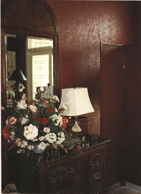
Another, super simple way to get the same sort of damask effect on walls is to simply rag the polyurethane on like I did here...


tone-on-tone paint treatment damask

I lied.  In this case I actually used a semi-gloss paint in an ever-so-slightly darker shade than the flat walls, but the general idea is the same.  You can also paint the walls with a satin or semi-gloss and rag a flat paint on top, of course.  Notice what a great (scan of a) photo this is in comparison to the ones I took of my own room?  That's because I didn't take this photo; a professional photographer did.  What a luxury that was, to have good photos of something I'd done.  I can't for the life of me remember the photographer's name now.  (If you happen to see this, Jan, maybe you can help me out so I can give him due credit. :)

I'll leave you with another Random Photo of the Week.  I don't remember what I was looking for when I stumbled on this one, but the hanging lamps made me go "Wow!"  Until I looked at it for another second or two and wondered how much maneuvering you'd have to do to get into bed without knocking your head into them.  I love the way they look though...


From Interiors And Decorations (basically an ad-spam site with pretty pictures).

See you manana! 

Wednesday, November 17, 2010

Detour continued...

I again accomplished nothing in The Room, but I did finally switch my family room from its spring and summer to fall and winter duds and thought I'd share how easy it is to do.  My reaction the first time I heard about seasonal decorating was "Way too much money; way too much work."  By the sixth or seventh time I happened upon an article expounding on the idea, I was on board.   I really didn't put a whole lot of time or money into it, but the difference between the two looks is still pretty dramatic...


spring and summer interior decor seasonal decorating

Spring and Summer


fall and winter seasonal decorating interior decor

Fall and Winter


spring and summer seasonal decorating interior

Spring and Summer


fall and winter seasonal interior decorating

Fall and Winter


Aside from the furniture placement (which is mostly dictated by the need to pull the sofa away from the baseboard heater in the winter), the two things that make the biggest impact are the floor and window coverings.  I made the curtains, drapes and valances, but honestly don't recall now how much I spent.  The area rug in the Fall and Winter room was purchased at Home Depot several years ago and used to serve year-round.  When I got the bug to do seasonal decorating, I didn't want to invest mega-bucks in another area rug so I ordered three yards of six foot wide #8 canvas from  Chicago Canvas, hemmed the edges all the way around with a glue gun and then went to town painting it in all my favorite colors...


hand-painted canvas floor cloth with stencil and mosaic work


hand-painted canvas floor cloth with stenciling

I used stencils for the palm fronds and filigree, and a piece of dense foam to stamp on the mosaic work.  The simple design on the outer green portions was done with regular old artist's brushes.  For well under fifty bucks, it really freshens up the room in the springtime and is such an easy project for just about anyone to try their hand at, whether free-hand, stenciled or even a solid color.  I made another, narrower one to run along the sliding glass door with a much simpler design (that I wish now I had done first because I really prefer it to the large one)...


hand-painted canvas floorcloth with stenciling

Though it does show dirt a lot more than the large one, I like the simplicity of it.


I also dress the mantle a bit differently for the seasons...

spring and summer seasonal interior decorating dressing the mantle

Spring and Summer


fall and winter seasonal decorating dressing the mantle

Fall and Winter


On the kitchen end of the room which is open to this family room side, I switch out my towels and rugs, using a coral-y orange in the spring and summer and a deep green in the fall and winter.  (I didn't snap pics of that because I'm behind on laundry and all of my spring and summer towels are dirty!)

There are other things I'd like to do differently between seasons, such as GET RID OF MY SOFA, and sew up some different cushions for the wicker chairs and some wintertime covers for the kitchen chairs, but for now I'm really happy with these simple changes twice a year.  

Tomorrow, I promise hope to have progress to show you on The Room.  It's supposed to be a bit warmer here, and if that turns out to be the case I'll be doing (drumroll...) the drum table!  Woot, I can't wait!  

Tuesday, November 16, 2010

Detour ahead!

We're taking a bit of a detour today because I simply cannot live with my house in the filthy, disorganized state I've let it fall into over the past six weeks, so I'm taking today - and maybe even tomorrow! - off to clean.  But since I promised myself I'd blog here daily (or at least M-F), I don't dare fall down on the job less than two weeks in.  My friend Evin suggested that I post about how my obsession with the guest room re-do has caused the rest of my house (make that 'life') to fall apart, but that would become a whole new project in itself.  Imagine yourself in this scenario: You start cleaning your carpets, but don't finish up before you have to start a job for a client.  The client's room requires a lot of sewing, so your sewing room gets torn apart and threads tracked throughout the house.  The carpet shampooer gets set aside (after flooding the bathroom because the rag you tied around the faucet didn't actually contain the leak) in the hallway, because the carpet in the sewing room and two other bedrooms still need cleaning.  While out looking for fabrics for your client, you find the perfect fabric for your own living room drapes, so you end up shopping all over town for curtain rods... only to find the perfect bedding for your guest room.  Sometime in the midst of all of this, your thyroid meds prescription runs out and you don't dare ask for the doc to call it in because you've blatantly ignored four phone calls  going back four months to schedule your annual exam.  You finally finish the client's room, and days later the bed from the guest room is snapped up from a Craig's List ad.  Uh oh:  Christmas is coming, going to need a bed in there.  Hmmm, my son has been bugging me for years to start a blog.  This room re-do would be the perfect time!  Um... um...  really?  Right now, huh?  Living room drapes to be sewn, carpets to be cleaned, four rooms completely torn apart, kitchen floor getting grodier by the day, and why am I so tired lately? Ohhhh, three weeks off the thyroid meds.    Why, sure!  Why not start a blog!?!  Yeeeeesh.

I digress.  I actually do have something to share today, though it's not from The Room.  While I did make some (minimal) progress yesterday, there's not enough to share, so when I got up this morning I was dreading facing this blog.  So instead, I went to read one of my new, favorite blogs - Addicted 2 Decorating,  and bless her heart, Kristi provided me with my quick and easy blog for today.     She shared "before" photos on a "great room" she's about to begin work on and one of the photos is of the fireplace, which has rather dated brick that she plans to paint.

Now I am absolutely, positively, not one of those people whose knee-jerk reaction to this idea is "OMG! No!  You can't paint brick!!!"   Nosiree, I'll paint pretty much anything and roll my eyes at the naysayers who gasp in horror as I do.  However, dated fireplace brick can also be easily changed without painting it, so that's the cheap and easy decor fix I'm going to show you today.  

We'll start with a photo of my exterior brick, because it's what my fireplace brick looked like originally, but I never thought to get "before" pics of my fireplace brick when I first changed the color of it 15 years ago....


update and change the color and texture of brick

As brick goes, it's not horrible by any means, but my family room fifteen years ago was done in muted shades of purple and sage, and at the time I just really felt my brick needed to be more rosy-hued.  I was able to get exactly the look I wanted by simply using very watered-down paints in the tones I wanted and sponging them onto the brick.  Brick being as porous as it is, it just soaked up that watery paint like a stain and voila! I had my perfect, rosy-hued brick... 

update and change the color and texture of brick


Then about ten years ago, we did a major remodel of our kitchen, which completely opened it up to the family room where this fireplace lives.  The remodel included this granite...


Which began to dictate my color choices throughout the room, and which did not work with the rosy-hued brick.  In fact, the original brick probably would have been perfect, but that seemed ever-so-boring an idea to me.   But I knew I wanted deeper tones, so that's where I started, and again by simply using very watered-down paints and universal tints.  Here's a photo showing the progress from rosy-hued (on the left) to a bit more earthen tones...

update and change the color and texture of fireplace brick

It was better, but I also was tired of the 'neatness'  of my brick.  I think there's actually a word for it, but I'm not a mason nor am I up on masonry terms, so 'neat' will have to do.  What I mean is the tooling, mostly:  Each brick is perfectly rectangular, and each row of mortar perfectly the same width.   I really, really like an older, antique-ier looking brick, with crumbled edges and a roughness to it.  Enter one of my favorite mediums....


So cheap; so versatile!  
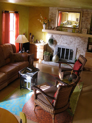
After deepening the color of the rest of the brick, I just troweled this on haphazardly, letting the brick show through in places and adding a bit of color on top of it to mimic the water staining you see on real, aged brick here and there, and I am so so so happy with the results...


                                         update and change the color and texture of fireplace brick


update and change the color and texture of fireplace brick


While I know I wasn't haphazard enough to produce a truly "aged" brick, it's a lot closer to what I was wanting.  And while I'm also definitely not one of those people who worries about resale value when I'm decorating my own home, it can't hurt to head those "OMG!  No!  You can't paint brick!" people off at the pass.  Because no one would look at this brick and say "Oh, geez - they painted the brick!"  

See you all tomorrow!